When I was a kid, playing adventure games meant staring at a blinking cursor. If you wanted to interact with the digital world, you had to type exactly what you wanted your character to do. “Open door.” “Pick up key.” “Talk to wizard.” It felt like magic, but it was also incredibly rigid. Those early text parsers were notoriously picky. If you typed “Grab the key” instead of “Pick up key,” the game would stubbornly refuse to understand you.
So when point-and-click adventure games arrived, they were an absolute revolution. Suddenly, you didn't have to guess the right verb. You could just look at the screen, see your options, and click. It was faster, more intuitive, and infinitely easier. Software design followed suit, and for the last few decades, the graphical user interface has ruled the world. We traded typing for clicking, and we never looked back.
But today, we are facing a strange paradox. The very interface that was supposed to make software easier to use often becomes the thing making it harder. It all comes down to the complexity threshold.
The 747 Dashboard Problem
Point-and-click is flawless for simple actions. Hitting "Play" on a video, toggling your Wi-Fi on, or "liking" a post will always be best served by a simple button.
But as software became more powerful, user intent became more complex. Every new feature required a new button, a new slider, or a new dropdown menu. Eventually, we reached a point where many modern user interfaces crossed the complexity threshold. They stopped looking like intuitive tools and started looking like the dashboard of a Boeing 747.
To combat these dense walls of icons and nested menus, a massive portion of modern design work is actually just triage. Designers ruthlessly filter out the features that matter to most users and hide or drop the ones that don't, all just to keep the interface approachable. Finding the right button in a cluttered interface has become just as frustrating as guessing the right verb in a 1980s text adventure.
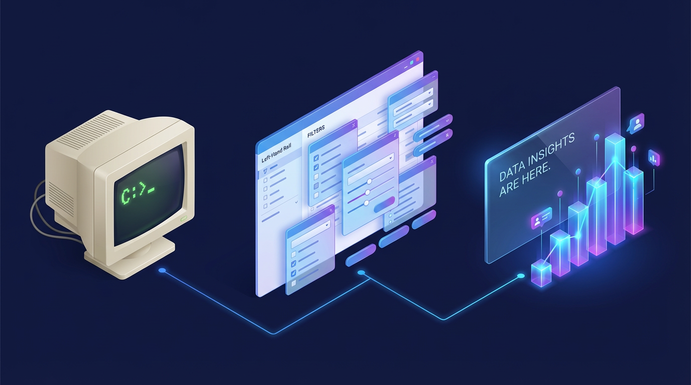
The Left-Hand Rail of Doom
A perfect real-world example of this is the travel industry. I used to work on a travel booking site, and we knew firsthand that flight search filters were a major pain point.
When you search for a flight, you are usually confronted with a daunting left-hand rail of checkboxes covering layover durations, specific airline alliances, baggage inclusions, and exact departure windows. It is overwhelming. We spent an incredible amount of time optimizing that space, trying to serve the advanced power users without completely alienating the casual vacationers.
But no matter how elegantly you design a 747 dashboard, it is still a 747 dashboard. The complexity threshold has been crossed.
The Hybrid Solution and Two Paths Forward
This is where the paradigm is shifting. Today, forward-thinking platforms are realizing that while clicking "Search" is easy, clicking twenty different filter parameters is not. To solve this, they are bringing back the text box, powered by Natural Language Interfaces based on modern LLMs.
Instead of hunting for the "Non-stop" checkbox, adjusting a slider to "Departure after 5 PM," and checking a box to exclude budget airlines, you can simply type:
"Find me a nonstop flight to London leaving Friday evening, returning Sunday, under $500, and not on a budget airline."
This shift is happening in two distinct ways. First, sites are building their own internal LLM agents. By leveraging modern LLM capabilities like structured output and function calling, a travel site can take your natural language prompt and instantly translate it into the exact JSON payload their backend needs to filter the flights. You bypass the cluttered UI entirely.
But there is a catch. Users do not want to learn how to talk to fifty different site-specific AI chatbots. They increasingly want to use their own preferred agents, like a browser-level assistant, to navigate the web.
This is where standardized infrastructure like WebMCP (Model Context Protocol for the Web) comes into play. WebMCP is designed specifically for the scenario where a user brings their own agent to a site. Instead of forcing that browser agent to blindly scrape a webpage and guess where the "Submit" button is, WebMCP allows developers to expose structured actions and tools directly via client-side JavaScript. Your ubiquitous browser agent can securely call the exact function needed to execute your complex request, completely bypassing the site's visual UI.
The Dynamic Threshold
But what if we take this a step further? The complexity threshold does not have to be a fixed line drawn by a UX designer. It could be dynamic.
Imagine a future where your browser agent learns your habits, preferences, and intent over time. Because it understands the site's capabilities through WebMCP, it can act as a real-time UX designer.
Instead of showing you the standard 747 dashboard, the browser dynamically picks and renders only the UI elements that matter to your specific journey. If the agent knows you strictly fly Star Alliance and always check a bag, it might completely hide those filters and instead just present you with three highly relevant sliders for departure times.
There is still a lot of experimentation to happen in this space. But the idea that the interface itself could mold to your specific needs, moment by moment, completely redefines how we think about design.
The Future is Symbiotic
We abandoned text inputs decades ago because they created too much friction. But as our graphical interfaces grew bloated and overwhelming, clicking became the friction.
Does this mean the point-and-click UI is dead? Absolutely not. The future of UI isn't a total return to text. It is strictly hybrid.
We can see this hybrid future taking shape with innovations on the other side of the equation, like MCP Apps. While WebMCP helps agents talk to websites, MCP Apps allow the chat interface to spin up miniature, interactive visual components right inside the conversation. If you ask your browser agent to analyze flight pricing trends, it does not just spit back a text summary. It renders an interactive, point-and-click chart right in the chat so you can hover, zoom, and explore.
For actions below your personal complexity threshold, buttons will reign supreme. But for complex, multi-layered tasks, the era of hunting through endless menus is ending. Tomorrow's best software won't force you to choose between clicking and typing. Instead, it will seamlessly learn your habits and offer you the exact right tool for the job.
Comments
Reply
Reply
Reply
Leave a comment
Comments are moderated and may take some time to appear.